creative site design
Design strategies that delight users and lift search rankings — actionable tips you can apply today.
This guide teaches a practical, repeatable process for building creative, usable websites that rank. You'll get layout patterns, content techniques, performance targets, SEO-ready templates, and a launch checklist tailored for busy small businesses.
Core principles of creative site design
Creativity should be purposeful. The best-looking sites get results because they guide attention, reduce friction, and make it effortless to act. Use these guiding principles on every page.
Design with intent
Every visual decision should serve a goal: capture attention, explain value, or prompt action. Start with the most important action on each page.
Know your user
Use basic personas to prioritise content and reduce cognitive load. For local businesses, emphasise phone, service areas, and trust signals above the fold.
Structure for scanning
Use clear headings, short paragraphs, and visual breaks. 70% of visitors scan; make it easy for them to find the CTA or service they need.
Design for performance
Creative doesn't mean heavy. Combine impactful visuals with lightweight assets, modern formats, and lazy loading so design and speed go hand-in-hand.
A practical UX-first design process
Follow these steps each time you design a page to ensure clarity, speed, and conversions.
Define goal
What is the single action you want from visitors? Contact, booking, purchase, or quote request?
Map user flow
Sketch the path from entry (organic search, ad, social) to conversion. Remove distractions and keep the path short.
Prototype & test
Build a lightweight prototype (Figma or code). Test with 3–5 users or staff for clarity, then iterate before launch.
Designing for search: SEO & structure
Design choices directly affect SEO. Structure content so search engines and humans both understand what your page is about.
Use an SEO-first content hierarchy
- H1 for main topic (one per page).
- H2/H3 to structure services, benefits, and FAQs.
- Bullet lists for scannability — Google often pulls lists into SERP snippets.
Meta & structured data
Every page needs a unique meta title and meta description. Add relevant schema (LocalBusiness, Service, FAQ) to improve rich results.
Quick schema snippet (LocalBusiness)
{
  "@context":"https://schema.org",
  "@type":"LocalBusiness",
  "name":"Your Business",
  "url":"https://yourdomain.com",
  "telephone":"+61 400 000 000",
  "address":{"@type":"PostalAddress","addressLocality":"Sydney","addressCountry":"AU"}
}
Add Service and FAQ schema where appropriate — they increase the chance of rich snippets in search results.
Visual hierarchy: layout patterns that convert
Arrange elements to guide attention: headline → value → proof → CTA. Below are patterns that work well for service businesses and small brands.
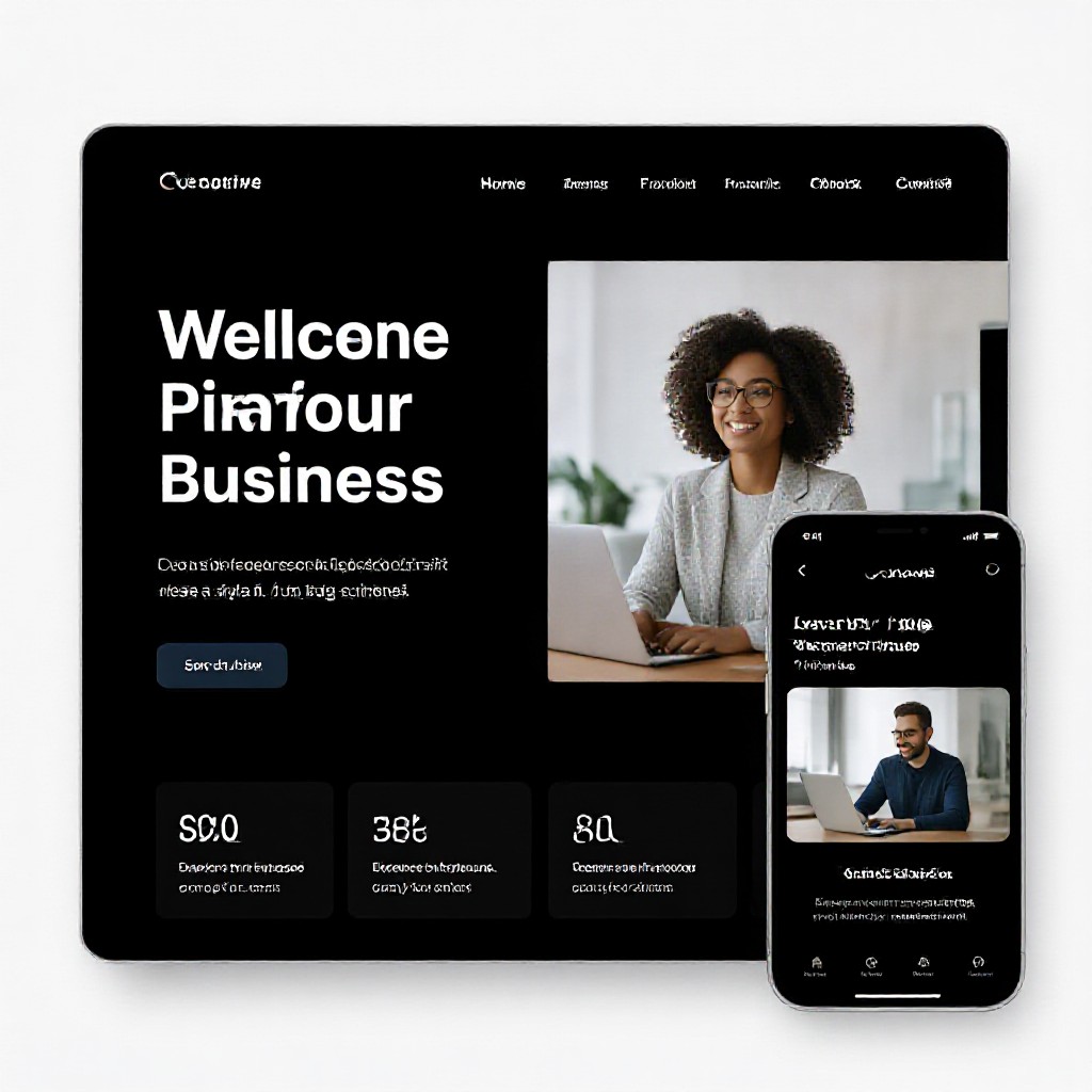
Hero with clear CTA
Large benefit headline, short subheadline, 1–2 CTAs, trust badges (reviews, awards), and a strong hero image or short video.
Service cards
3–6 service cards with icons, 1-line benefit, and a secondary link. Keep them uniform in size for scanning.
Social proof strip
Show reviews, case studies, or logos in a repeating carousel to build trust without overwhelming the layout.
Images, video & media — optimise for speed and clarity
High-quality media is essential for creativity, but mishandled assets kill performance. Follow these rules.
Formats & sizes
- Use WebP or AVIF for photos. Fallback to optimized JPEGs if needed.
- Serve responsive images with srcset for multiple device widths.
- Compress images to under 200KB where possible for hero and content images.
Lazy loading & placeholders
Use lazy loading for below-the-fold images and consider low-quality image placeholders (LQIP) or subtle blurred placeholders to improve perceived performance.
Practical image attributes
Always include descriptive alt text and implement captions where appropriate. Alt text helps accessibility and provides semantic clues for search engines.
Performance & Core Web Vitals
Search engines and users favour fast sites. Aim for the following measurable targets, and use them as pass/fail checks during QA.
How to improve performance (practical)
- Critical CSS inline for above-the-fold styles; defer non-critical CSS.
- Reduce third-party scripts and load them asynchronously (analytics, chat widgets).
- Use server-side caching and a CDN; enable gzip/Brotli compression.
- Preconnect to important origins (fonts, APIs) and use rel=preload for hero images.
Accessibility: design that works for everyone
Accessible design improves conversions and reduces legal risk. It should be part of your design checklist.
Colour contrast
Ensure text contrast meets WCAG AA (4.5:1 for normal text). Use tools like Lighthouse or Contrast Checker.
Keyboard & screen reader
All interactive elements must be reachable by keyboard and have clear focus states. Use ARIA where necessary but prefer semantic HTML.
Small checklist
- All images have alt text
- Buttons use
buttonelements or role=button - Forms have labels and error states
Test, measure & iterate
Design decisions should be validated. Measure behaviour, learn, and iterate.
Analytics & funnels
Set up analytics events for your primary CTA, phone clicks, form submissions, and key scroll depths. Use funnels to identify drop-off points.
A/B testing
Test one variable at a time — headline, CTA colour, or hero image. Run tests until sample sizes produce statistically significant results.
Tools, templates & resources
Practical tools to speed design and validate results.
Design
- Figma — quick prototyping
- Hero Patterns / Unsplash — imagery
Performance
- PageSpeed Insights
- WebPageTest & Lighthouse
SEO & testing
- Google Search Console
- Hotjar for session replay
Launch checklist (do this before promoting)
- Unique H1 and meta title per page
- Schema for LocalBusiness or Service where relevant
- All images optimised, responsive, and lazy-loaded
- Core Web Vitals passing or improving (LCP <2.5s, CLS <0.1)
- Analytics and conversion events set up
- Accessibility basic checks complete (contrast, alt text, keyboard)
- Submit sitemap to Google Search Console
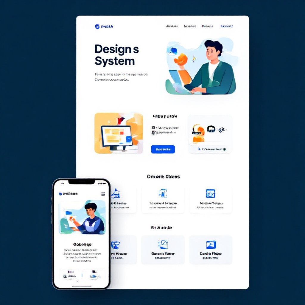
Creative patterns you can reuse
These patterns combine creative visuals with conversion-focused layout — adapt them to your brand.
Split-screen hero
Text + CTA on left, dynamic image or short looping video on right. Keeps focus and reduces scrolling.
Sticky booking bar
Sticky bottom bar on mobile with phone and one-click booking increases conversions by making action always available.
Step-by-step service explainer
Three-step visuals (Call → Visit → Fix) reduce objections and set clear expectations.
Frequently asked questions
How long does it take to design and launch a single page?
Will creative design hurt SEO?
What’s the easiest way to test UX changes?
Make your site both creative and effective
If you want a creative site that converts — focus on clarity, speed, and measurable goals. Need help turning ideas into a live website? Congero builds high-converting, SEO-ready sites in under 60 seconds via our demo process.
Congero: professional mobile-first websites, unlimited updates, and local SEO included — all for a flat monthly fee. No lock-in contracts.